Table of Contents
- Decoding Google’s Mobile-First Indexing
- The Mechanics of Broken Mobile Interactions
- Interactive Elements and Core Web Vitals
- Best Practices for Mobile-Responsive Web Mapping
- Testing and Optimizing Your WordPress Mobile Performance
- Conclusion
1. Decoding Google’s Mobile-First Indexing

The Mobile-First Standard
For years, search engines crawled the desktop version of a website to evaluate its content, structure, and keyword relevance. That paradigm has completely flipped. Under Google’s mobile-first indexing system, the search engine crawls, indexes, and ranks your entire website using its smartphone user-agent.
If your desktop site features flawless interactive maps, but those same elements fail to load, display cut-off text, or overlap other structural sections on a mobile screen, Google views your entire page as broken. The mobile version is now your primary flagship storefront. Ranking algorithms use your mobile layout as the baseline metric to measure content quality and determine your position on global search result pages.
The SEO Consequences
Failing to meet mobile usability standards carries severe technical penalties that directly suppress your organic traffic growth:
- Algorithmic Suppression: Google’s automated indexing systems actively flag pages with severe mobile usability errors, such as "Content wider than screen" or "Clickable elements too close together". These flags prevent your URLs from climbing to competitive top-three search ranking spots.
- Loss of AdSense Revenue Potential: Google AdSense relies heavily on healthy, sustained organic traffic metrics. If mobile users run into design bugs and bounce away within seconds, your overall pageviews drop, directly lowering your automated ad impressions and daily ad earnings.
- Universal Ranking Drops: Mobile usability is not just a mobile-only ranking factor. If your mobile layout performs poorly, it can drag down your desktop search visibility as well, since your single core mobile-first index score is permanently lowered.
2. The Mechanics of Broken Mobile Interactions

The "Zoom and Pinch" Trap
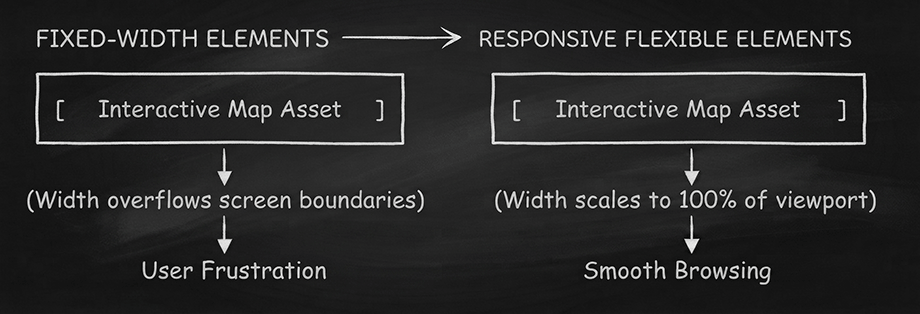
When interactive maps or graphics are designed with fixed pixel widths (like a hardcoded width of 1200px), they completely fail to accommodate mobile screens. The element overflows past the screen boundaries, causing the website container to break.
To read text or interact with a map marker, users are forced to perform awkward zoom and pinch gestures on their glass screens. This disrupts natural vertical scrolling, breaks the visual flow of your article, and creates immediate psychological friction. If a user has to fight the webpage layout just to see your content, they will close the tab and return to the search results.
The Scrolling Nightmare
One of the most disruptive user-experience flaws on mobile web design is the "canvas scroll trap." This occurs when a large interactive map fills the entire height and width of a smartphone screen viewport, capturing all touch gestures.
- The Scroll Trap Mechanism: When a mobile user tries to swipe downward to continue reading your blog article, their finger lands on the map container. Instead of scrolling the webpage down, their touch gesture pans or zooms the map instead.
- The Trapped User Experience: The webpage completely freezes in place, locking the user within the map grid boundaries.
To escape this loop, the visitor must carefully find a tiny pixel sliver of blank margins along the edge of the device screen to scroll past. Implementing smart touch behaviors—such as requiring a dual-finger gesture to pan the map while allowing a single-finger swipe to pass over it—is essential to keep your website navigation fluid and clean.
3. Interactive Elements and Core Web Vitals

Interaction to Next Paint (INP)
Core Web Vitals are user-centered metrics that Google uses to score your site’s real-world performance. A key metric is Interaction to Next Paint (INP). INP measures how fast your webpage updates visually after a user performs an action, such as clicking a map pin or hovering over a custom geographic region.
If your interactive elements use bulky, unoptimized scripts, a mobile browser has to process too much layout data at once. This creates an uncomfortably long delay between the moment a user taps a screen element and the moment the visual update actually paints onto the screen. High-quality interactive content must respond instantly to touch feedback to maintain a low, healthy INP score and protect your organic search engine visibility.
Cumulative Layout Shift (CLS)
Another critical Core Web Vital factor is Cumulative Layout Shift (CLS), which tracks how much your webpage layout unexpectedly moves or jumps around while loading.
Interactive items like maps frequently trigger high CLS scores if they are embedded without explicit dimensions:
- The Sizing Bug: If a browser loads your map script after the main page text without pre-allocated height and width placeholders, the page text will suddenly drop down several hundred pixels when the map finally renders.
- The Accidental Tap: This unexpected shift causes mobile users to accidentally tap on the wrong link or ad placement, triggering heavy user frustration.
- The Penalty: High layout shifting flags your WordPress site as unstable to search crawlers, creating a direct drop in your search performance.
4. Best Practices for Mobile-Responsive Web Mapping
Fluid Vector Asset Scaling
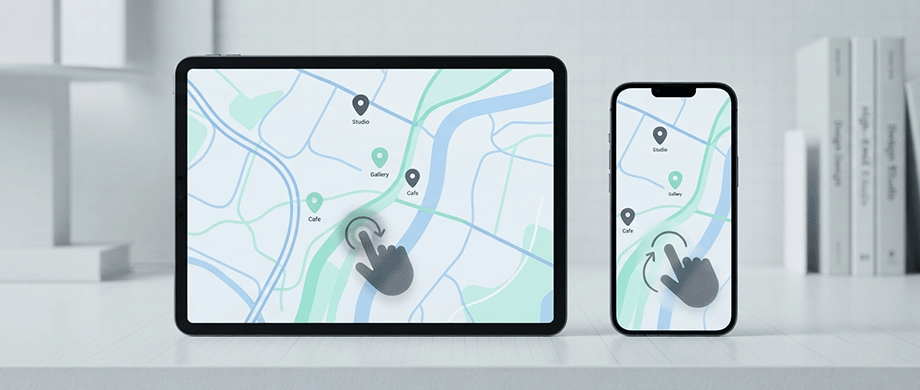
To deliver an exceptional mobile experience, map elements must adapt dynamically to varying screen sizes instead of utilizing fixed dimensions. The foundation of responsive web mapping lies in shifting away from traditional raster images (such as PNG or JPEG tiles) and embracing vector-based rendering engine mechanics.
By building maps entirely out of Scalable Vector Graphics (SVG), your mapping assets scale smoothly to match any responsive container size. Whether an article is read on a large desktop display or a compact smartphone screen, vector elements scale proportionally, preserving razor-sharp visual clarity without pixelation or layout breakdown.
Smart Touch Gestures
Navigating an intricate map on a touch screen requires a fundamentally different control scheme than using a desktop mouse pointer. Desktop layouts rely on fine-tuned cursor interactions, whereas mobile environments demand forgiving touch zones and intuitive gesture configurations.
Implementing smart touch behaviors prevents users from getting stuck in a scroll trap on your mobile pages:
- Dual-Finger Map Navigation: Require mobile users to use two fingers simultaneously to pan or zoom around inside the map canvas.
- Seamless Page Scrolling: Allow standard single-finger vertical swipes to pass safely over the map area, keeping the page scroll smooth and functional.
- Generous Touch Target Buffers: Expand the clickable hit boxes around map markers to ensure users can effortlessly tap pins with their fingers without accidental input errors.
5. Testing and Optimizing Your WordPress Mobile Performance

Crucial Testing Tools
You cannot optimize what you do not measure. Even if an interactive map looks perfectly fine when testing it live on your personal smartphone, it may still contain hidden performance layout bugs that trigger silent automated search penalties. To guarantee your interactive WordPress content passes Google’s mobile-first standards, you must leverage objective developer diagnostic tools.
Using specialized testing suites allows you to view your website through the exact eyes of search engine crawlers:
- Google PageSpeed Insights: This foundational tool analyzes your mobile performance score, explicitly flagging any bulky JavaScript scripts or large Cumulative Layout Shift (CLS) issues caused by your interactive modules.
- Chrome DevTools Emulator: By right-clicking your WordPress page, hitting Inspect, and toggling the Device Toolbar, you can instantly test how your interactive elements respond across dozens of simulated smartphone screen sizes and network speed conditions.
- Google Search Console (Mobile Usability Report): This dashboard updates you on structural site health, warning you if text is too small to read or if clickable items are located too close together on mobile viewports.
Lightweight Code Loading
The final step to building an AdSense-approved website that ranks highly on mobile devices is eliminating code clutter. Interactive elements often rely on expansive JavaScript libraries. If these scripts load globally across every single page of your WordPress site, they will destroy your global mobile page speeds.
Optimizing your script delivery requires implementing clean asset management strategies:
- Conditional Script Execution: Ensure your mapping engine only loads its asset code on the exact URLs where an active map shortcode or block is present, leaving the rest of your articles unburdened.
- Deactivating Heavy External APIs: Shift away from mapping engines that require heavy, constant communication with external server networks during initial page render stages, as these connections delay mobile load times.
- Minification and Deferral: Configure your asset scripts to load using defer or async tags so they wait to execute until after your primary article text finishes rendering cleanly on screen.
Conclusion: Deliver a Flawless Mobile Experience
Interactive features like custom maps are powerful tools for boosting engagement, but they must be built to handle mobile traffic seamlessly. Adhering to mobile-first indexing standards, avoiding canvas scroll traps, and optimizing for Core Web Vitals guarantees that your WordPress site satisfies both your human visitors and search engine crawlers.
When you offer a fast, responsive, and easy-to-use mobile layout, your site’s dwell time climbs, bounce rates drop, and your positions in search result pages improve. If you want an out-of-the-box solution that handles all of these technical details automatically, our Responsive WordPress Map Plugins are built from the ground up to scale cleanly, load instantly, and look beautiful on every smartphone screen.

About the Author
Botrous Kerolos has been designing and building interactive maps for the web since 2009 — from early Flash/SWF maps to modern SVG — and leads development at WP Map Plugins, helping WordPress sites turn static content into fast, accessible, interactive experiences.