Table of Contents
- Keyboard Navigation: Making Maps Operable Without a Mouse
- Screen Reader Support: Making Maps Perceivable
- Color Contrast and Visual Accessibility
- Responsive Design and Zoom Compatibility
- Alternative Content and Redundant Mechanisms
- Conclusion
1. Keyboard Navigation: Making Maps Operable Without a Mouse
WCAG Requirements for Keyboard Accessibility
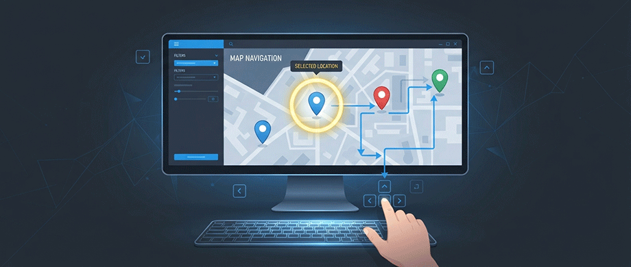
WCAG Success Criterion 2.1.1 requires that all functionality of web content be operable through a keyboard interface. For interactive maps, this means users must be able to pan, zoom, and select map features without relying on a mouse. Yet many web map platforms only allow users to pan and zoom using keyboard controls, leaving points and polygon features inaccessible.
The standard requires that users can both select and activate map features using keyboard-only controls. This includes:
- Tab navigation to move between interactive elements.
- Arrow keys to cycle through map features.
- Enter or Space key to activate selected items.
- Logical tab order that follows the visual layout of the page.
Implementing Keyboard Accessible Markers
When building interactive maps, ensuring markers respond to keyboard input is essential. For Google Maps implementations, making markers clickable requires setting the gmpClickable property to true and adding a click event listener. Users can then navigate markers using the Tab key to focus on the first marker, arrow keys to cycle through multiple markers, and Enter key to "click" and open associated information windows.
Test Your Map's Keyboard Accessibility
To verify your map meets keyboard accessibility requirements:
- Tab through the page: The focus ring should move through elements in a logical order from top to bottom without getting stuck.
- Use arrow keys: When multiple markers exist on the same map, arrow keys should cycle through them.
- Press Enter: Clickable markers should respond to the Enter key, opening info windows or performing expected actions.
- Check for tab traps: Users should never get stuck in a loop where they cannot tab away from the map.
For a best-practice example of keyboard-navigable maps, see the World-Map-Explorer open source project, which enables users to navigate with arrow keys while receiving real-time audio feedback about their location.
2. Screen Reader Support: Making Maps Perceivable
WAI-ARIA and Role Attributes
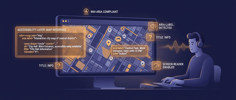
Screen readers rely on semantic HTML and WAI-ARIA attributes to interpret and announce content. For map components, proper role attributes and accessible labels are critical. The Map component should:
- Use
role="img"to convey that the element is a visual representation of geographic data. - Include
aria-labeloraria-labelledbyto provide an accessible name describing the map's purpose. - Set
tabindex="0"to make the map focusable for keyboard users.
For SVG maps specifically, the W3C provides detailed accessibility guidelines. Key recommendations include:
- Use
titleanddescchild elements to explain the function and content of graphics. - Provide text equivalents for graphics that do not include explanatory text content.
- Build descriptions from meaningful parts when a graphic is constructed from components.
Adding Screen Reader Descriptions to Markers
Each interactive element on your map should have descriptive text accessible to screen readers. For Google Maps markers, the title option provides screen reader-readable text. When a user holds the mouse pointer over a marker or navigates to it via keyboard, the screen reader announces this text.
Best practices for descriptive marker text include:
- Be specific: Use full names that include the building and function (e.g., "Smith Library – East Entrance" instead of "Entrance").
- Use consistent structure: Apply the same format across all labels.
- Avoid duplicate titles: Never reuse the same title for different map points.
- Use clear delimiters: Include dashes or colons to help screen readers pause appropriately.
Alternative Content for Complex Map Data
Maps often present visual information and hide key details behind interactive clicks. To ensure access for all users, include alternative formats that provide the same information. This can include:
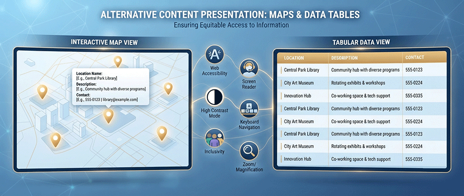
- Data Tables: Tables provide an accessible way to present spatial data. Ensure the first row contains clear, meaningful column headings and keep the table focused on relevant information.
- HTML Alternatives: When map features cannot be made directly keyboard accessible, provide indirect selection through associated controls. Accordion sections that highlight locations on the map when expanded offer a text-based alternative for navigating map information.
- Location Lists: For real estate or travel blogs, include a text-based list of locations with links to detailed content, ensuring users who cannot interact with the map still access the information.
3. Color Contrast and Visual Accessibility
WCAG Contrast Requirements
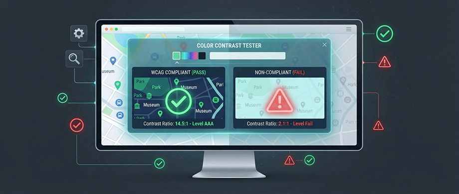
Color contrast is vital for users with low vision and for viewing content in varied lighting conditions. WCAG 2.1 SC 1.4.3 requires a contrast ratio of at least 4.5:1 for text, and 3:1 for large text or graphical elements. When these standards are not met, users with visual impairments may be unable to read text or distinguish map elements.
For interactive maps, ensure compliance for:
- Link colors in your map footer and location descriptions.
- Top bar buttons and hover colors.
- Sidebar and location text and hover styles.
- Map attribution text against varying tile backgrounds.
Do Not Rely on Color Alone
Color should never be the sole means of conveying information. A user with color blindness cannot distinguish between red and green markers, making a map that relies solely on color for categorization unusable. Instead:
- Combine color with symbols: Use shapes, patterns, or icons alongside colors.
- Add text labels: Include descriptive text on markers and in legends.
- Use multiple visual cues: Combine color with size, texture, or position.
Testing Your Map's Color Accessibility
Use available tools to test your map's color compliance:
- Color Safe or WebAIM's Contrast Checker help assemble compliant color palettes.
- Browser extensions can test contrast across your map interface.
- Simulate color blindness using tools to preview your map through different visual impairments.
When configuring map applications with custom styling options, remember to verify the color contrast of focus indicators with other graphic elements.
4. Responsive Design and Zoom Compatibility
WCAG Zoom Requirements
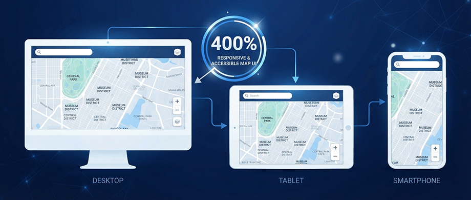
WCAG requires that functionality is maintained when users zoom to 400% at 1280 horizontal and 400% at 1024 vertical resolution. For maps, this means:
- Responsive sizing: The map width should depend on viewport width; users should not have to scroll horizontally to see any map element.
- Button management: At full zoom, buttons may overlap and become unusable. When buttons begin to overlap, move all buttons to a single "tools" button that expands a pane of scrolling tools.
- Pop-up sizing: Pop-ups and panes should not require horizontal scrolling or overflow horizontally at full zoom.
Mobile-Friendly Design for On-the-Go Users
Mobile-friendly design helps meet zoom accessibility requirements and serves users accessing maps on devices. For interactive maps:
- Enable two-finger panning on mobile devices.
- Set appropriate touch target sizes Increasing marker size reduces the precision required to interact with them, improving accessibility on touchscreen devices. Default markers meet the WCAG AA minimum size standard, but for AAA compliance, marker size should be increased.
- Use percentage-based layouts for both map containers and UI components.
- Test on multiple devices and zoom levels.
The World-Map-Explorer project demonstrates an inclusive approach: it looks like a regular OpenStreetMap interface but when accessed with a screen reader, provides full feedback through that assistive technology.
5. Alternative Content and Redundant Mechanisms
Providing Multiple Ways to Access Information
Maps present visual information and often hide key details behind interactive clicks. To ensure access for all users, include alternative content that provides the same information. A data table is the most effective alternative, allowing screen reader users to access spatial data in a linear, accessible format.
When adding a table:
- As covered above, data tables remain the most effective alternative for spatial data.
- Keep the table simple and focused on relevant information.
- Include only essential columns (city name, population, key attributes) while hiding technical fields (FIPS codes) that don't add value.
Audio Descriptions and Additional Context
For video content accompanying maps, ensure accessibility through:
- Captions for users who are deaf or hard of hearing.
- Audio descriptions for users with low vision, providing essential visual context.
When adding audio descriptions, you can either:
- Create two versions of the video and provide a link to the described version.
- "Burn in" audio descriptions directly into a single video file.
The Introduction and Workflow Guidance
Every web map application should start with an introduction to the site's purpose followed by a description of the primary workflow. This introductory text should also contain contact information, providing a useful alternative path for accessing information or completing tasks.
For screen reader users, this introduction provides essential context before they begin navigating the map interface. It answers the question "Why am I here?" and sets expectations for what the map offers.
Conclusion: Build Maps That Work for Everyone
Creating accessible web maps is not a one-time task but an ongoing commitment to inclusive design. The Web Content Accessibility Guidelines provide a robust framework, but as the research shows, general guidelines often need domain-specific interpretation for complex interactive content like maps.
The key principles to remember:
- Keyboard accessibility is non-negotiable—every map feature must be operable without a mouse.
- Screen readers need descriptive labels, titles, and WAI-ARIA attributes to interpret map content.
- Color contraststandards must be met, and color alone should never convey critical information.
- Alternative content provides fallback access for users who cannot fully interact with the map.
By implementing these accessibility features, you expand your website's reach to the estimated 1.3 billion people worldwide living with significant disability. You also improve the experience for users with temporary limitations, slow internet connections, or device constraints. Accessible design benefits everyone.

About the Author
Botrous Kerolos has been designing and building interactive maps for the web since 2009 — from early Flash/SWF maps to modern SVG — and leads development at WP Map Plugins, helping WordPress sites turn static content into fast, accessible, interactive experiences.